Visual · Sonic · Verbal
Poorr Identity
An identity isn't a logo. It's a posture — a set of decisions a brand makes about how it looks, reads, and sounds when nobody's watching. The next three chapters are every decision Poorr has already made on your behalf.
Color Palette
Six colors that decide how Poorr feels on every surface — each one given a fixed role in the system.
Click any swatch to copy its hex. Double-click to open a live UI mock and pair it with another color — the combinator scores contrast against WCAG AA/AAA so you can see exactly which pairings hold up in real interfaces.
Borrow a palette
What if Poorr wore your colors instead?
Drop in a photo, a moodboard, a competitor's homepage, your kid's drawing — the lab pulls its five strongest colors and hands them to you. It's a thirty-second way to feel out an alternate version of Poorr before you commit to anything. Click any color to copy hex, or pipe it into the combinator below.
Typography
Two typefaces decide how Poorr reads on the page — a display face for headlines, a body face for everything else.
Type your name, your tagline, your favorite lyric — anything — and watch how the system handles it. It's the fastest way to feel whether Poorr's voice fits the words you'd actually want to put in its mouth.
Heading Typeface
DM Sans
Poorr
Light — Headings
Medium — Labels
Semibold — Emphasis
Body Typeface
Lora
Poorr
Regular — Body text
Italic — Taglines, quotes
Small — Captions
Composer
What does Poorr look like out in the world?
Type a slogan, a button label, and a second line — and watch them land on a business card, a website, a magazine cover, and a phone screen, all at once. Swap the logo treatment, mess with the words, see how Poorr carries itself across surfaces. Download any one as a PNG and pin it somewhere — it's the closest thing to seeing the brand in real life before it exists.
Logo Concepts
Nine conceptual directions for Poorr, exploring wordmarks, monograms, and geometric treatments.
Each SVG animates as it enters view — a hand-drawing effect that reveals the mark. These are starting points, not finished logos; the final mark would be developed with the acquiring brand team.
Wordmark
Wordmark. POORR in DM Sans bold lowercase, warm charcoal (#1F1815) on warm off-white (#FAFAF7), citrus-yellow (#F5B800) horizontal bar rule beneath. Reads as an editorial nameplate — at home on a print workbook cover, on an iOS splash screen, on a budgeting podcast's show art. The posture is grown-up and grounded, not playful.
Square Monogram
Square Monogram. A solid warm charcoal (#1F1815) square with a single P in DM Sans bold, citrus yellow (#F5B800), centered. Works as the iOS app icon for the Poorr App, as a Twitter/X profile image for the brand handle, and as the closure seal on the welcome-kit mailer. Reads unmistakably as a financial-brand mark without borrowing cool-blue fintech cues.
Initial + Accent Bar
Initial + Accent Bar. A bold lowercase 'p' in DM Sans, warm charcoal (#1F1815), with a citrus-yellow (#F5B800) vertical accent bar sitting flush-right. Use case: the brand's Instagram profile avatar, the email-newsletter masthead, the favicon on Poorr.com. Simple enough to render at 16 pixels, distinctive enough to catch the eye on a grid.
Circle Monogram
Circle Monogram. A citrus-yellow (#F5B800) filled circle with POORR in DM Sans bold warm charcoal (#1F1815) wrapping the upper arc. Works as a certification badge at the foot of a Poorr Workshop certificate, as a partnership-mark on a nonprofit co-branded landing page, and as a printed pin for Poorr team use. Warm, round, serious.
Split Logotype
Split Logotype. 'POO' in warm charcoal (#1F1815) and 'RR' in citrus yellow (#F5B800), both set in DM Sans bold, flush-left. Splits the morpheme visually — the common English word on one side, the brand mark on the other. Use case: launch campaign hero, the workbook cover for the debt-paydown guide, a Substack banner.
Slash Mark
Slash Mark. POORR in DM Sans bold warm charcoal (#1F1815), with a forward-slash in citrus yellow (#F5B800) between the second and third letter. Use case: a minimal podcast watermark, a secondary brand mark for Poorr Side (the side-hustle content set), and animated versions for audio-waveform pre-roll. Distinctive without being precious.
Code Brackets
Code Brackets. [POORR] in DM Sans bold, warm charcoal (#1F1815), with the brackets rendered in citrus yellow (#F5B800). Reads as a brand-systems mark — at home in a style guide, on a developer portal for Poorr Partners, and as the mark for the Poorr at Work B2B license product. Signals rigor without tipping into cold-tech aesthetics.
Vertical Stack
Vertical Stack. POORR set vertically in DM Sans bold, one letter per line, warm charcoal (#1F1815), with a citrus-yellow (#F5B800) dot terminating the bottom. Use case: a skinny sidebar ad unit, an Instagram story sticker, and the spine of the printed Poorr Workbook. Works where horizontal space is scarce and vertical scroll is the frame.
Ring Monogram
Ring Monogram. A thin-rule warm charcoal (#1F1815) ring containing POORR in DM Sans bold, with a citrus-yellow (#F5B800) dot breaking the ring at the top. Reads as a seal — suitable for the Poorr Couples membership badge, as the footer mark on a press release, and as a secondary watermark on editorial images. Formal, but not corporate.
Build your own
Lockup Playground
Ever wonder how the Poorr mark would feel on a hat, a hoodie, a sticker, an app icon?
Drag the wordmark and the mark wherever you want. Swap the shape under them, change the surface, scale each piece up or down — then export your version as a PNG. None of this is the "official" answer. It's a sandbox so you can feel out how Poorr behaves under your own hands before the brand even has owners.
Drag either piece. Use the sliders to resize.
Brand Voice
A three-step way to feel out how Poorr sounds — read it, hear it, then pick it.
The voice is one of the things you can't see in a screenshot. So we built three small ways to put it in your ear: a written line, a real recording, and a blind test where you decide which take feels most like the brand.
Read it
A line Poorr would actually say. Notice the cadence before you notice the words.
“Poorr speaks plainly to people the rest of fintech speaks past. It trusts the reader to know their own bank balance and their own ambitions, and it declines to pretend those ambitions must include a yacht. The voice is patient, specific, and grown-up — kind without being soft, direct without being cold.”
Hear it
Now in a real voice. Different speaker, same character — that's the test of whether the voice holds.
Pick it
Two takes, no labels. Trust your ear — we'll reveal who's behind each one after.
Which voice sounds more like Poorr to you?
Two voices read the same line. We're keeping the names hidden on purpose — pick whichever one feels like Poorr in your gut, and we'll reveal who's behind each take after. There's no wrong answer; the test is really just a way to hear the brand take shape in your own ear.
Listen to both, then pick.
A spec, not a vibe
Voice Guidelines
Poorr writes in a warm-declarative voice. The short definition: confident, kind, specific, grown-up. The operational definition: statements rather than suggestions, plain language rather than fintech jargon, readers addressed as adults rather than as people to be rescued. The rule of thumb: if a line sounds like a bank-marketing deck or a motivational-speaker keynote, rewrite it.
State, don't suggest. Hedging reads as condescension to this audience.
Use you, sparingly. Direct address when it earns its keep; never as performative intimacy.
Plain English over finance jargon. Explain every term the first time it appears.
Modesty sells to this reader. Oversell reads as the category they left.
Name the audience. 'Not-yet-rich' is an allowed phrase; 'emerging wealth' is not.
Voice stays the same under bad news. No pivot to gentle tones when the subject is debt.
On voice · Off voice
Your rent is twelve hundred. Your take-home is thirty-two hundred. That is a ratio worth looking at.
Let's take a moment to explore whether your housing costs are aligned with your broader financial wellness goals.
Poorr names the numbers and the ratio directly; the off-voice version uses three euphemisms in one sentence to avoid naming anything.
Paying down seventeen thousand dollars of credit-card debt is not fast. It is a two-year project if the minimums are honored. That is the real number.
Your debt journey is unique to you, and we're here to support you every step of the way as you build toward financial freedom.
On-voice names the timeline and the project honestly; off-voice replaces information with encouragement, which is what the reader has already rejected.
The 401(k) match is the closest thing to free money in American financial life. If your employer matches to six percent, you contribute six percent. That is the whole rule.
Don't leave money on the table! Your 401(k) match is a key part of optimizing your long-term wealth-building strategy.
On-voice gives the reader a rule they can act on today; off-voice gives them an exclamation point and no specifics.
Therapy costs what it costs. Before you schedule a session, find out what your plan covers and what the sliding-scale networks charge in your city.
Investing in your mental wellness is one of the most powerful investments you can make. Find a therapist who feels right for you.
On-voice treats cost as the legitimate first question; off-voice avoids it, which is why the category has a credibility problem with this reader.
Most side-hustle advice online is selling you a course on how to sell courses. Skip it.
There are many exciting ways to build additional income streams in today's gig economy — the key is finding the one that aligns with your passion.
On-voice names the scam pattern directly; off-voice launders it into 'exciting' and 'aligns with your passion.' The reader can already tell.
Sonic Identity
How Poorr Sounds Across Industries
10 radio ad concepts — one for each industry Poorr is positioned in.
Each script shows how the brand voice can adapt to different audiences while staying unmistakably Poorr. Visitors often spend a long time here, clicking through ads, smiling at the ones that land. That's the point — every listen is a small deposit in the brand's familiarity, and that familiarity accrues to the owner.
Personal Finance
View industry →“You know that feeling when you check your balance on a Tuesday and it is already the wrong number. Poorr is for that feeling — a personal finance app built for people who are not rich. Budget, pay down debt, sleep better. Poorr dot com.”
Gig Worker Tools
View industry →“It's Sunday night. Your rideshare week earned you eight hundred and forty-two dollars. After mileage, gas, and the part you owe in April, the real number is smaller. Poorr shows you that number on Sunday so Monday is easier. Poorr dot com.”
Debt Paydown
View industry →“Old way: four credit cards, four minimums, no plan, a lot of shame. New way: one payoff timeline, one monthly number, no moralizing. Poorr — a debt paydown tool that treats you like an adult. Poorr dot com.”
Affordable Housing
View industry →“I used to think the rent was just the number on the lease. Then Poorr showed me what percent of my paycheck it actually was, and what to do about it. Now I know what my ceiling is. Poorr dot com.”
Affordable Mental Health
View industry →“When was the last time a mental-health brand asked what you could afford before it asked what you were feeling? Poorr starts there. Regional cost-of-care, sliding-scale networks, straight answers. Poorr dot com.”
Childcare Affordability
View industry →“For the not-yet-rich with kids. That is who Poorr is for. The true cost of childcare after every subsidy, every tax credit, every benefit your employer buries in an open-enrollment PDF. Poorr dot com.”
Money Literacy Education
View industry →“Hey, do you actually know what withholding is? I thought I did. Turns out I didn't. Poorr has a piece on it. Thirty minutes, in plain English, and my next paycheck made sense. Poorr dot com.”
Side Hustles
View industry →“Poor means lacking. Poorr means claimed. Claiming means naming the thing honestly — including the side-hustle advice that works, and the side-hustle advice that does not. Poorr dot com.”
Affordable Meal Planning
View industry →“It's Saturday morning. The fridge is nearly empty, the kids want something decent, and the grocery budget is what it is. Poorr sends a five-dinner plan on Sundays that costs what it says. Printable, foldable, on the fridge. Poorr dot com.”
Thrift & Secondhand Commerce
View industry →“You do not need a new stand mixer. You need a used one that works. Poorr has a guide — which platform, what price, what condition looks like in the photo. Furnish the kitchen for a quarter of the number. Poorr dot com.”
How the name scales
Brand Architecture
One brand name, many product surfaces — and a pattern that decides how each one gets named.
Architecture is the part nobody sees until it's broken. Get it right and Poorr can extend into ten verticals without any of them feeling like an afterthought. Get it wrong and every new product needs a new round of naming.
The pattern
Poorr + [single short noun]
Poorr as the parent, one short everyday English noun as the extension. The pattern keeps every sub-brand readable at a glance, reinforces the parent mark on each usage, and avoids the temptation to invent sub-brand names that would compete with the parent for attention. Short nouns work because the parent name is already doing the distinctive work.
Rules
- Parent name Poorr always appears first, never truncated, never abbreviated.
- The suffix is one English noun between three and seven letters.
- No hyphens, no compound suffixes, no camel-case inside the mark.
- The suffix describes the surface or the audience plainly — Poorr App, Poorr Workbook, Poorr Kids — rather than inventing a new concept.
- Pluralization happens on the suffix, not on Poorr.
Examples
Poorr App
the core iOS and Android personal-finance product.
Poorr Workbook
the mailed monthly paperback budgeting companion.
Poorr Couples
the guided monthly session for two-person households.
Poorr Paydown
the debt-paydown workspace inside the app.
Poorr Kids
the childcare-affordability module and workbook.
Poorr Rent
the renter-focused housing calculator and editorial.
Poorr Mind
the affordable-mental-health literacy library.
Poorr Side
the honest side-hustle and secondary-income content set.
Poorr Plan
the weekly five-dinner meal plan and shopping list.
Poorr Thrift
the secondhand buyer's guide library.
Brand Applications
Directional mockups showing how Poorr could appear across physical and digital touchpoints.
Treat these as imagination fuel, not a visual mandate — each one is a spark for what you might build, a reference for what a designer could run with, and a piece of ambient storytelling for visitors who stop by and picture the brand in the world.
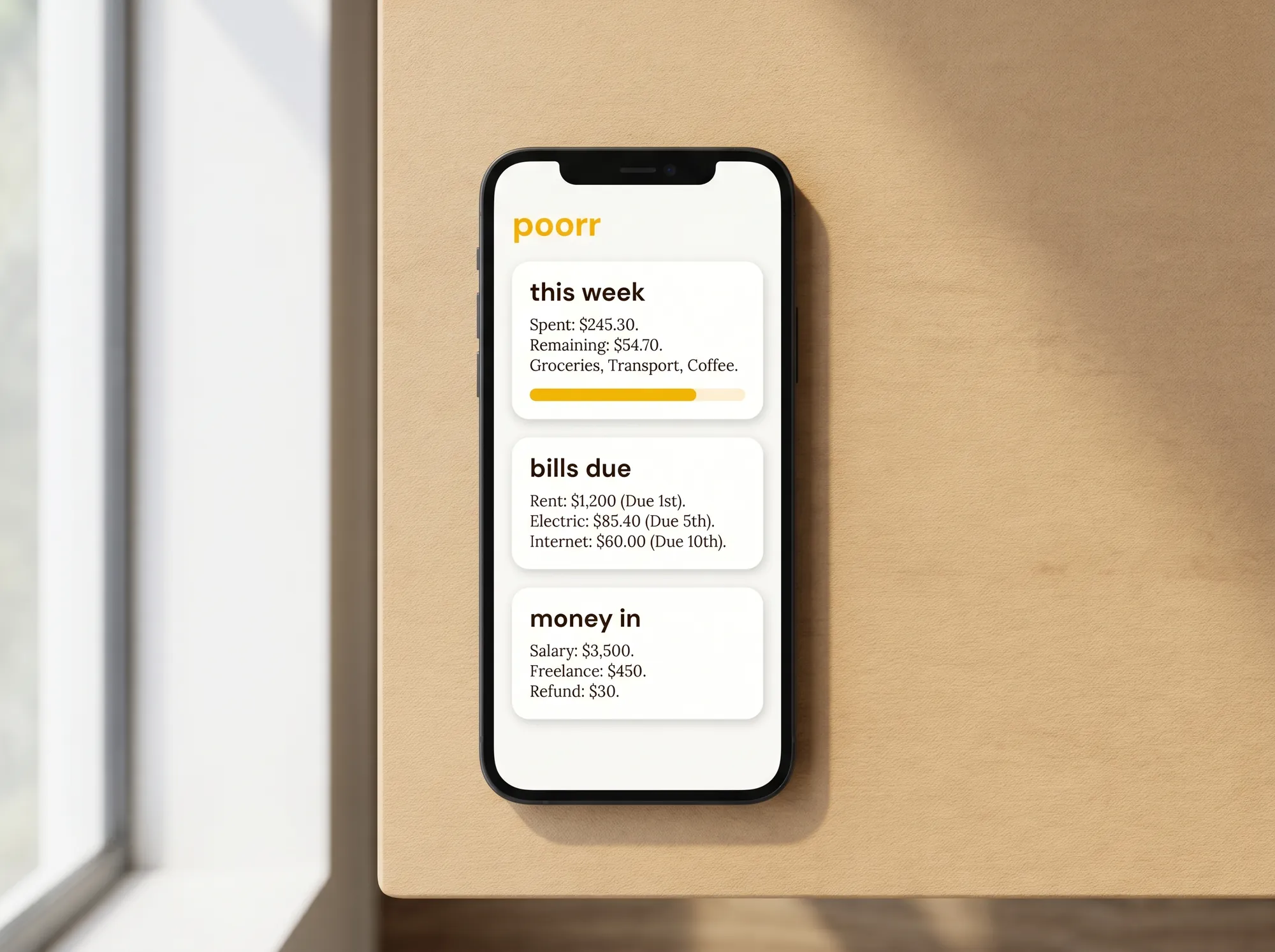
Poorr Mobile App — Home Screen
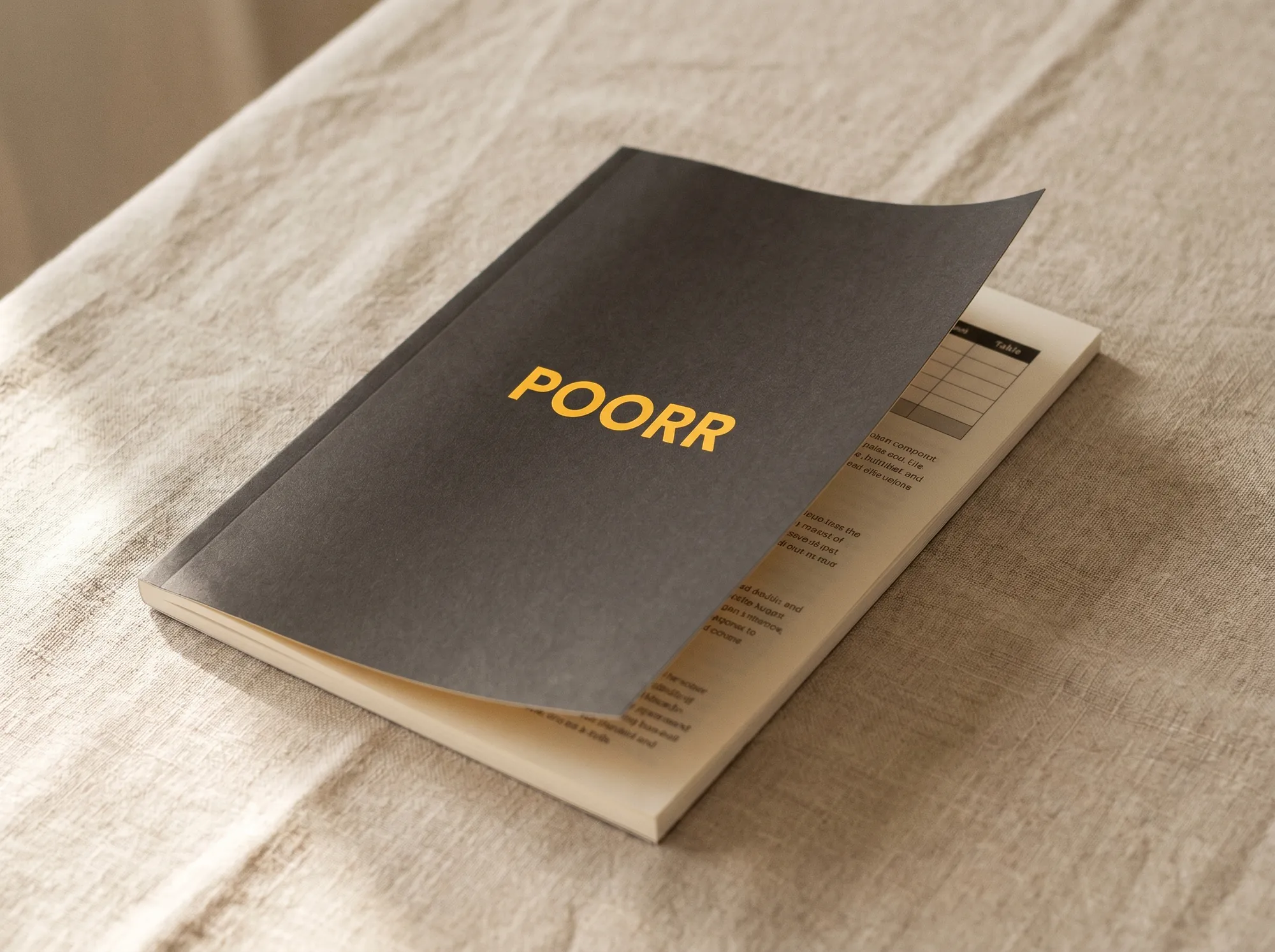
Poorr Monthly Workbook
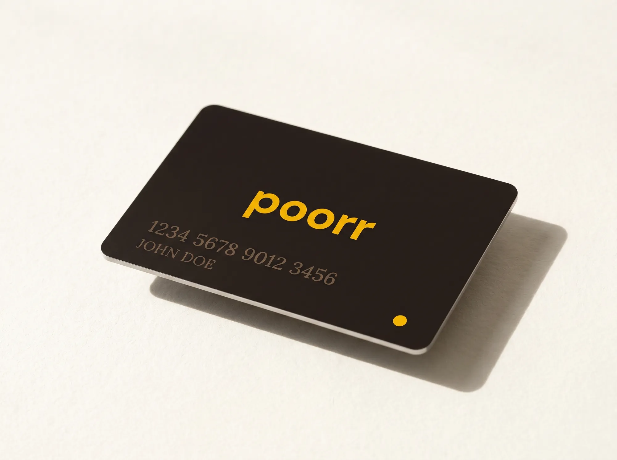
Poorr Metal Debit Card
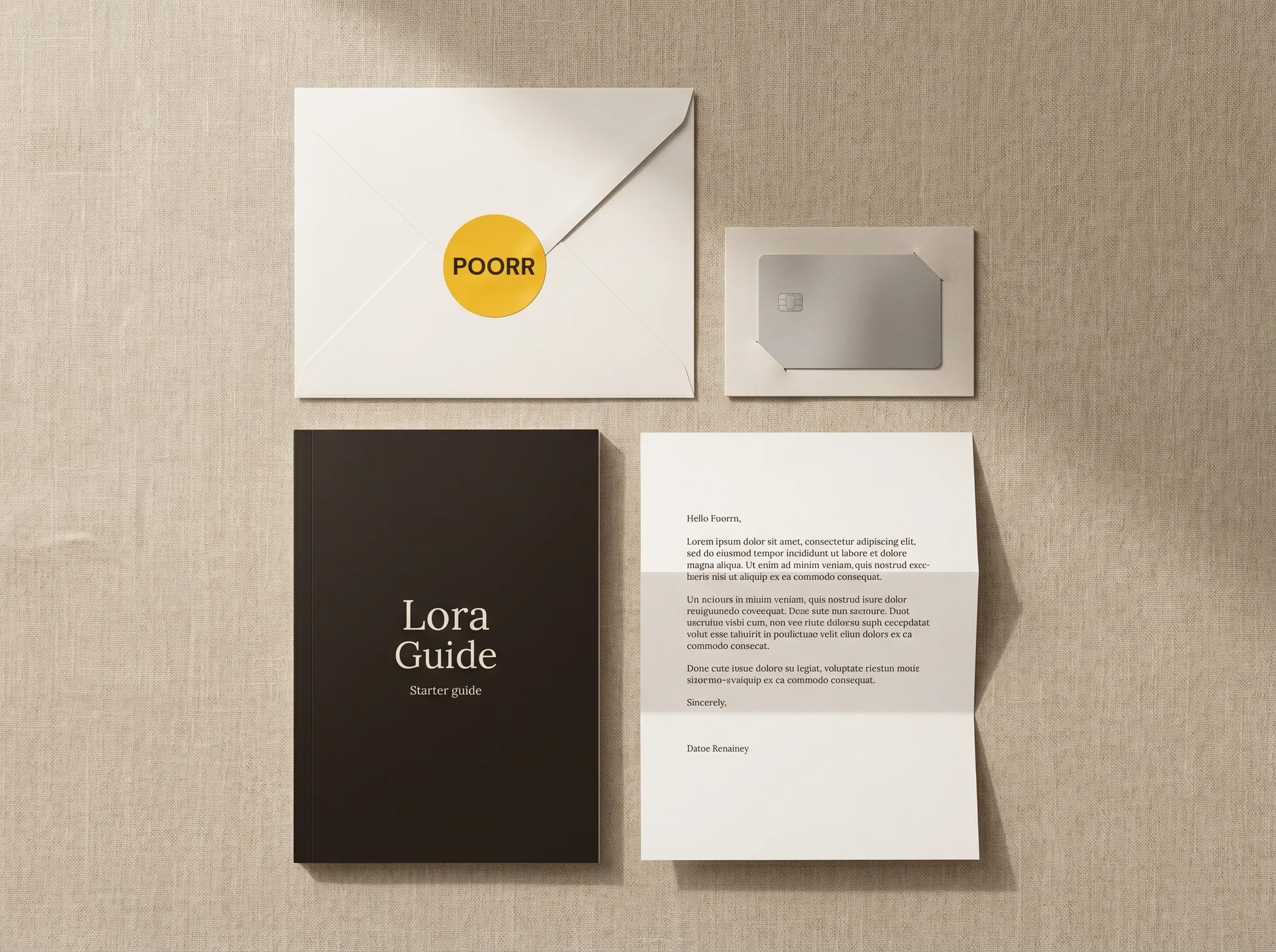
Welcome Kit Unboxing
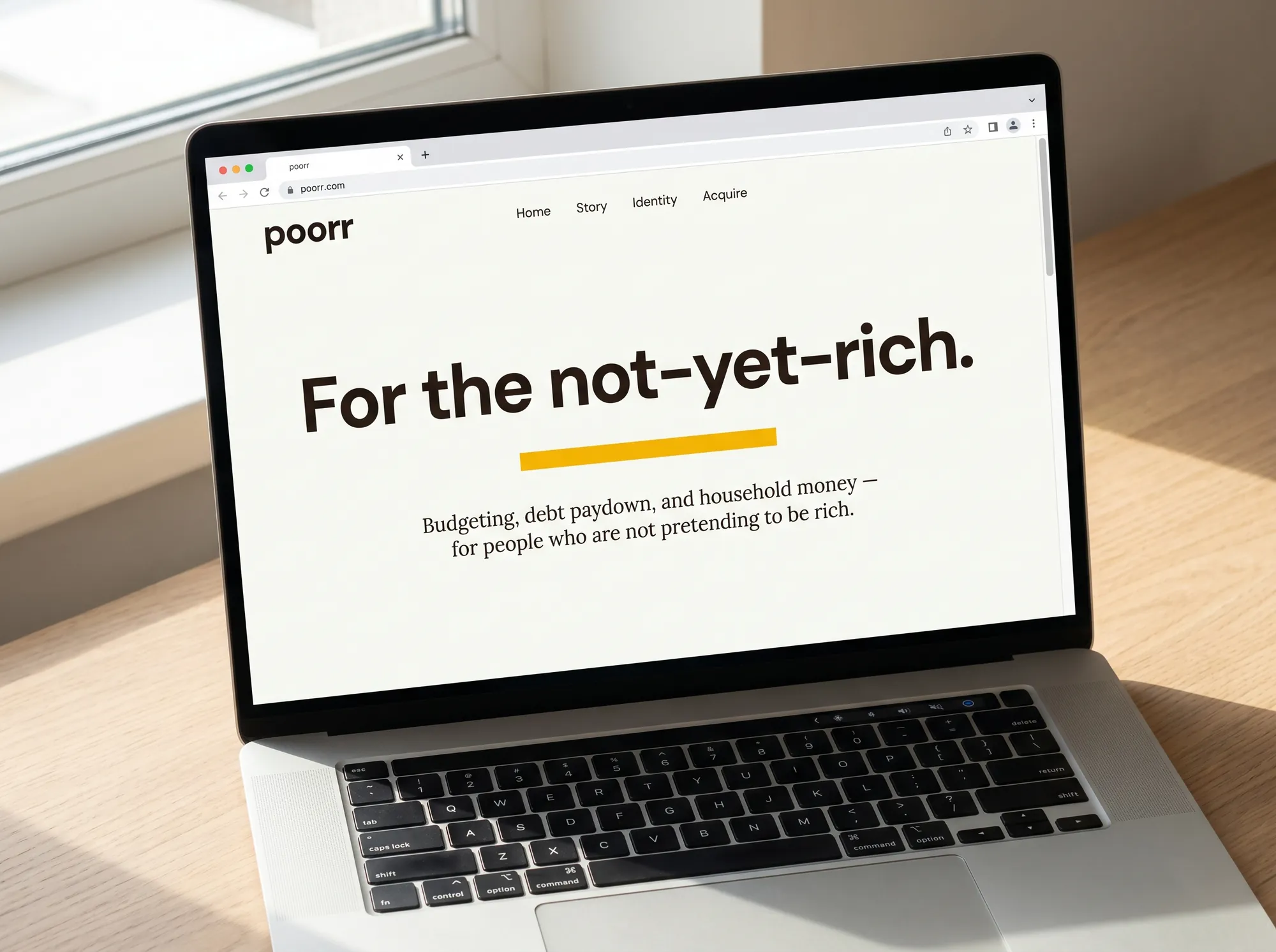
Poorr.com Desktop Homepage
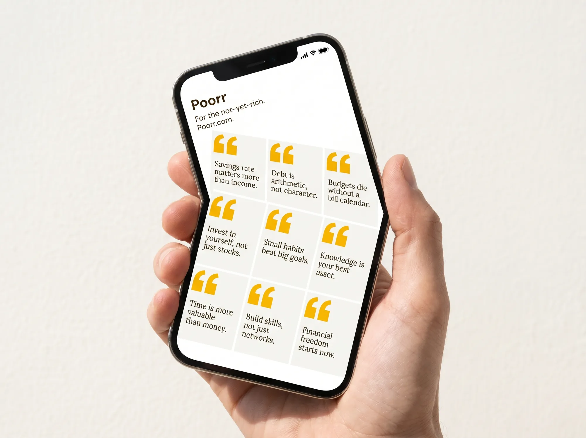
Instagram Carousel Grid
These mockups aren't a mandate — pick a posture:
The mockups exist to seed possibility — for you, and for every curious visitor who lands here and starts imagining Poorr as a real thing.
Visual Tools
Two interactive ways to bend Poorr toward your direction — and walk away holding something tangible.
Remix one of the mockups above, or compose a hero card from scratch. Both export as PNGs you can drop into a deck, share, or pin to your desktop. Visitors who build something here tend to remember the brand — that's the whole point.
Make a Poorr mockup that's yours
Pick any mockup, swap the colors, rewrite the line — and download the remix. Ten seconds, one PNG.
Drop Poorr on a poster, a billboard, or a slide
Headline, backdrop, layout — compose a 1200×900 share card and walk away with something tangible.
For the not-yet-rich.
Poorr speaks plainly to people the rest of fintech speaks pa